Using the tikz package in Latex, I recently created some pretty cool state transition diagrams:
|
|
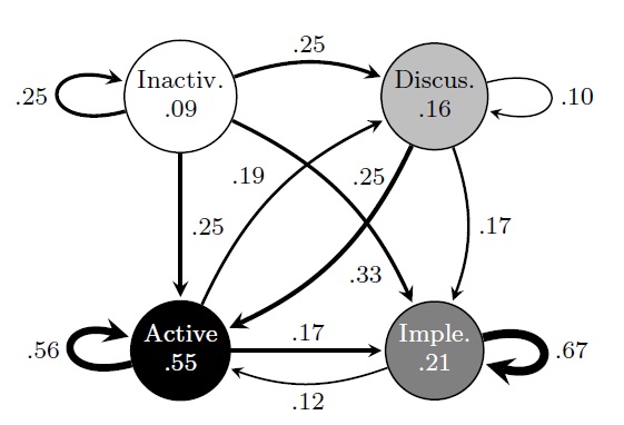

These diagrams show four states (the circles), and the transition probability between them (the lines and associated numbers). They also encode some meta data:
- The name of the states (the text in the circles)
- The percentage of time spent in each state (the numbers in the circles)
- The transition probabilities, shown both as the numbers next to the lines, and the thickness of the line, to provide extra visual indication
- The colors of the circles also align with the colors of other diagrams (not shown here) in my article, for more visual reinforcement and to ease the burden on the reader
All of this created with some simple Latex code:
\begin{tikzpicture}[->,>=stealth,shorten >=1pt,auto,node distance=2.9cm, semithick]
\tikzstyle{every state}=[fill=gray,draw=black,text=white]

\node[state, fill=white, text=black, inner sep = -3pt]      (1) {\small \begin{tabular}{c}
    Inactiv. \\
    {\footnotesize .09}
\end{tabular}};
\node[state, fill=lightgray,text = black, inner sep = -3pt]         (2) [right of=1] {\small \begin{tabular}{c}
   Discus. \\
    {\footnotesize .16} \end{tabular}};
\node[state, fill=black, inner sep = -3pt]         (3) [below of=1] {\small \begin{tabular}{c}
    Active \\
    {\footnotesize .55}\end{tabular}};
\node[state, fill=gray, inner sep = -3pt]         (4) [below of=2] {\small \begin{tabular}{c}
    Imple. \\
    {\footnotesize .21} \end{tabular}};

\path
(1) edge[line width=1.20pt,loop left] node {\small .25} (1)
(1) edge[line width=1.20pt,bend left=20] node {\small .25} (2)
(1) edge[line width=1.20pt] node {\small .25} (3)
(1) edge[line width=1.20pt,bend left=20] node {\small .25} (4)
(2) edge[line width=0.60pt,loop right] node {\small .10} (2)
(2) edge[line width=1.53pt,bend left=20] node {\small .33} (3)
(2) edge[line width=0.87pt,bend left=20] node {\small .17} (4)
(3) edge[line width=0.96pt,bend left=20] node {\small .19} (2)
(3) edge[line width=2.42pt,loop left] node {\small .56} (3)
(3) edge[line width=0.87pt] node {\small .17} (4)
(4) edge[line width=0.70pt,bend left=20] node {\small .12} (3)
(4) edge[line width=2.87pt,loop right] node {\small .67} (4)


;
\end{tikzpicture}
What's great about using Latex to create these diagrams, as opposed to using a graphical editor or drawing program, is that the Latex code can be created programmatically. That is, you can create a simple tool that outputs the Latex code given an arbitrary data set (in this case, the numbers in the diagram). This is especially great if:
- Your data is likely to change often, and you don't want to keep manually changing the diagram
- You need to create many diagrams, and you hate manual, repetitive work as much as I do
- You value making your processes reproducible by others
- You want to impress your wife
###########################################################################
###########################################################################
# Given an object a, which contains an member object tran.median, which is
# itself a 4 x 4 matrix of transition values between states, output tikz Latex
# code.
printStateTransitions = function(a){

    opts=c(
    ",loop left",
    ",bend left=20",
    "",
    ",bend left=20",
    "",
    ",loop right",
    ",bend left=20",
    ",bend left=20",
    ",bend left=20",
    ",bend left=20",
    ",loop left",
    "",
    ",bend left=20",
    "",
    ",bend left=20",
    ",loop right"
    )

    counter<-1
    for (i in 1:4){
        for (j in 1:4){
            t <- a$tran.median[i,j]

            if (t>0.03){
                # 2.5 = max, 0 = min
                w <- t*4 + 0.2
                cat(sprintf("(%d) edge[line width=%.2fpt%s] node {\\small .%02.0f} (%d)\n", i, w, opts[counter], t*100, j))
            }
            counter <- counter+1
        }
    }
}
Here, I've hard coded the size of the input matrix (4x4) and played with some option values to make the diagram pretty to my eye, but you can easily roll your own flavor.
No comments:
Post a Comment